Why Don't You...

There are so many things to cover here…..so many places to start and directions to go. Why? Because Diana Vreeland, that’s why. A traditional start when she is the topic is not possible.
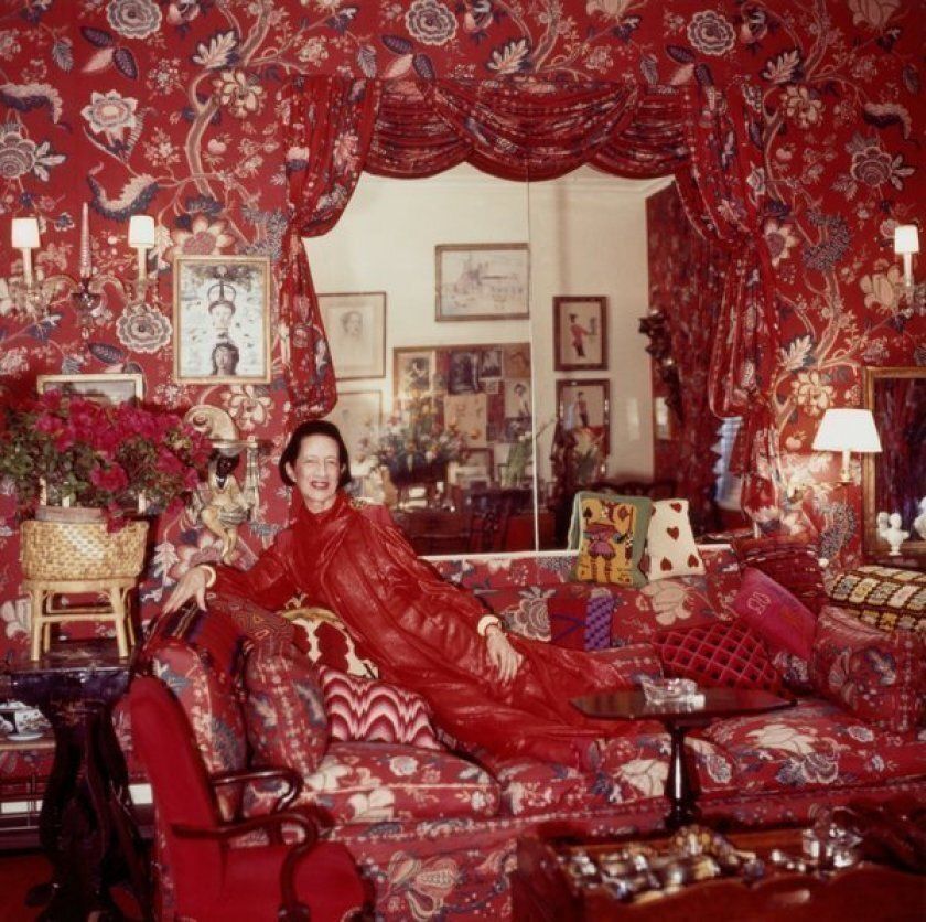
Diana Vreeland in her ‘garden in hell’
When I decided that scarlet would be my November color story, I thought of Diana Vreeland’s red living room (above) immediately. Do you know the story? Vreeland told Park Avenue designer Billy Baldwin that she wanted her living room to “look like a garden, but a garden in hell”. Message delivered. Message received.
We studied Vreeland in design school..if you went to fashion school, you no doubt did the same. She has her thumbprint on fashion trends, iconic editorials and even historical beginnings (like the bikini!) and endings ( like the marriage of King Edward III ). And she’s just flat out fascinating.

Why Don’t You…as seen in Harper’s Bazaar
Diana invented the fashion editor and began her run at Harper’s Bazaar. She was there for 25 years and penned an advice column “Why Don’t You…” which was little snippets of unexpected and somewhat outlandish advice offered up at a time when the nation was slowly coming out of a deep depression and planted firmly in a recession. But the column, like her, was fascinating and probably the permission people needed to dream of normalcy….scratch that…luxury and frivolousness.
“Oh, the ‘Why Don’t You,’ column first appeared in 1936 [in Harper's Bazaar ]. ‘For a coat to put on after skiing, get yourself an Italian driver’s, of red-orange lined in dark green.’ That was one of them. ‘Have a furry elk-kid trunk for the back of your car.’ They were all very tried and true ideas, mind you. ‘Knit yourself a little skullcap. Turn your old ermine coat into a bathrobe... ‘Wash your blond child’s hair in dead champagne, as they do in France.’”
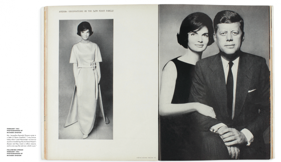
From 1936 to 1962 she was responsible for some of Harper’s Bazaar’s most iconic images and editorial layouts. She rubbed elbows with the fashion elite and celebrities and was often seen at Studio 54. She is the reason Jackie Kennedy chose Harper’s Bazaar for their first published presidential images. Diana was also on the guest list for the Inaugural Ball.
Dear Diana,
Everyone is wondering why we chose Harper’s Bazaar and they invent a million reasons. And no one says the real one, which is you.
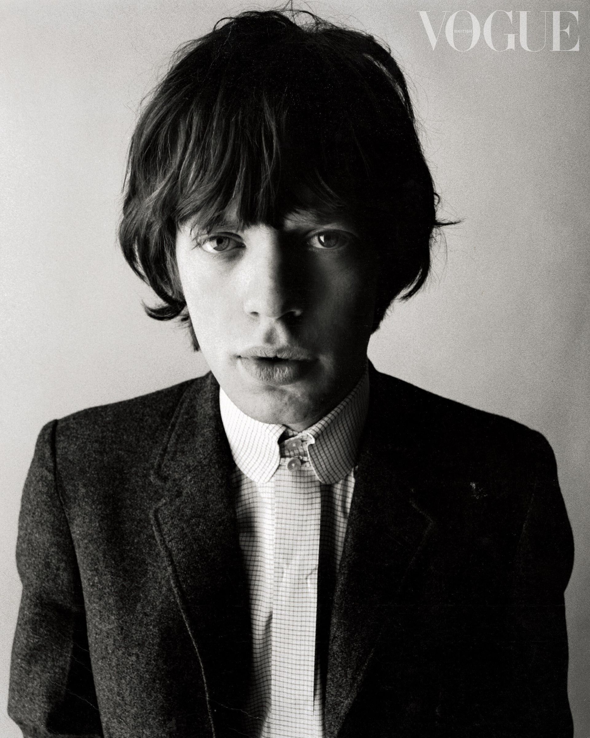
Mick Jagger on 1964 Vogue Cover
She eventually left Harper’s Bazaar (after making $18k/year for 25 years they offered her a raise….$1000) and went to Vogue…which became the new beneficiary of her visions, eccentricities, good taste and appreciation for pushing the envelope.
Vreeland’s ability to take an idea, even one that seemed so unbelievably outlandish, and make it come to life was a talent that cannot be taught. She loved to take a look and “push its faults”. She was mad for Mick Jagger’s lips and made Barbara Streisand’s nose the feature of the shot.
She would fly her photographer and models around the world with a vision that, to the intimidated, would seem impossible….yet not making it happen was not an option.

To do that, though, takes more than just vision. It takes a trusted team and a photographer with an open mind and creative eye. Vreeland wasn’t the only Harper’s Bazaar loss. She took her photographer, Richard Avedon with her.
Avedon got his start thanks to Vreeland. She hired him when he was 19 years old, giving him his big break and starting a partnership that lasted over 30 years. He not only entertained what many wouldn’t, he made it happen which was no small feet. Vreeland was notoriously demanding…I’m not sure that The Devil Wears Prada wasn’t about Vreeland instead of Wintour.
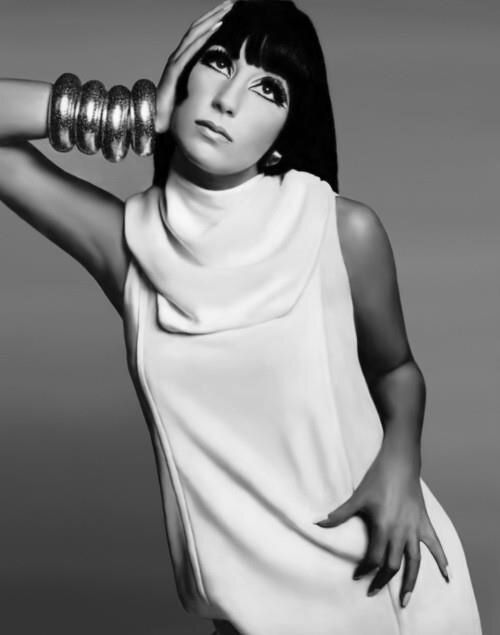
Cher photographed for Vogue by Richard Avedon
There was so much to this woman and I highly recommend the documentary Diana Vreeland: The Eye Has To Travel. There was no one like her and likely won’t be again. Sure there are influential people when it comes to trends and style, but Diana was a little like the shock and awe of fashion. She loved rouge and even wore it on her ears…something inspired by her love of geishas. She was quirky and adventurous. She saw something in the things that were not special and made them covetable…..think denim.
She was far ahead of her time. Once, when challenged about giving people what they wanted she fired back “you’re not supposed to give people what they want, you’re supposed to give them what they don’t know they want yet”.
I 100% believe she did that.
“The first rule that a geisha is taught, at the age of nine, is to be charming to other women… Every girl in the world should have geisha training.” —Diana Vreeland


